

Lune
How I designed an app and reduced user task error rate by 100%
In this case study, I'll show you how I built a minimal moon phases app. Why I linked up certain features in the way that I did. Why, after testing, I made changes to navigation. And how it made me a better designer by teaching me the importance of well-thought-out, intuitive information architecture.
Role: Lead product designer
Team: Solo project
Year: 2025
Timeline: 2 weeks
Challenges
How might we…
I posed two questions that eventually lead us to the reduced error rate:
How might we show the moon calendar?
How might we show moon details?
Solving for whom?
Users who want a minimal and clear app experience.
Astronomy and astrology lovers who want to learn more about the moon and its phases.
Process
Design Principle: Clarity
I established some design principles to help support the app. One I want to focus on, though, is clarity, which relates to the user error rate.
A clear tone
Labels and icons are easy to read
A minimal user interface
Intuitive navigation
A balanced visual hierarchy

User interviews also supplied some of this info.
User Interviews
I asked, "What do you like about moon or astrology apps?" Two users said they like seeing a calendar and details. Another user said that it's easy to understand.

I then asked a follow-up question. "What would be most helpful to you in a moon-focused astrology app?" Here easy to understand and read came up all 3 times. Along with a journal and the calendar.

A Competitive Analysis
I looked at apps for astrology and astronomy lovers. Both apps included a calendar. The astronomy app included moon details like illumination and moonrise times. The astrology app included things like the moon in the zodiac and birth chart data. It became clear to me now that I would be working with those who want astrology and astronomy info.


It was at this time I created my vision statement in the project overview doc.
“To unite science and spirit through a beautifully crafted moon phases app that inspires connection, curiosity, and cosmic awareness.”
I applied my findings to a user persona. Then it was time to do the same with a user journey map which I included below.
A User’s Journey
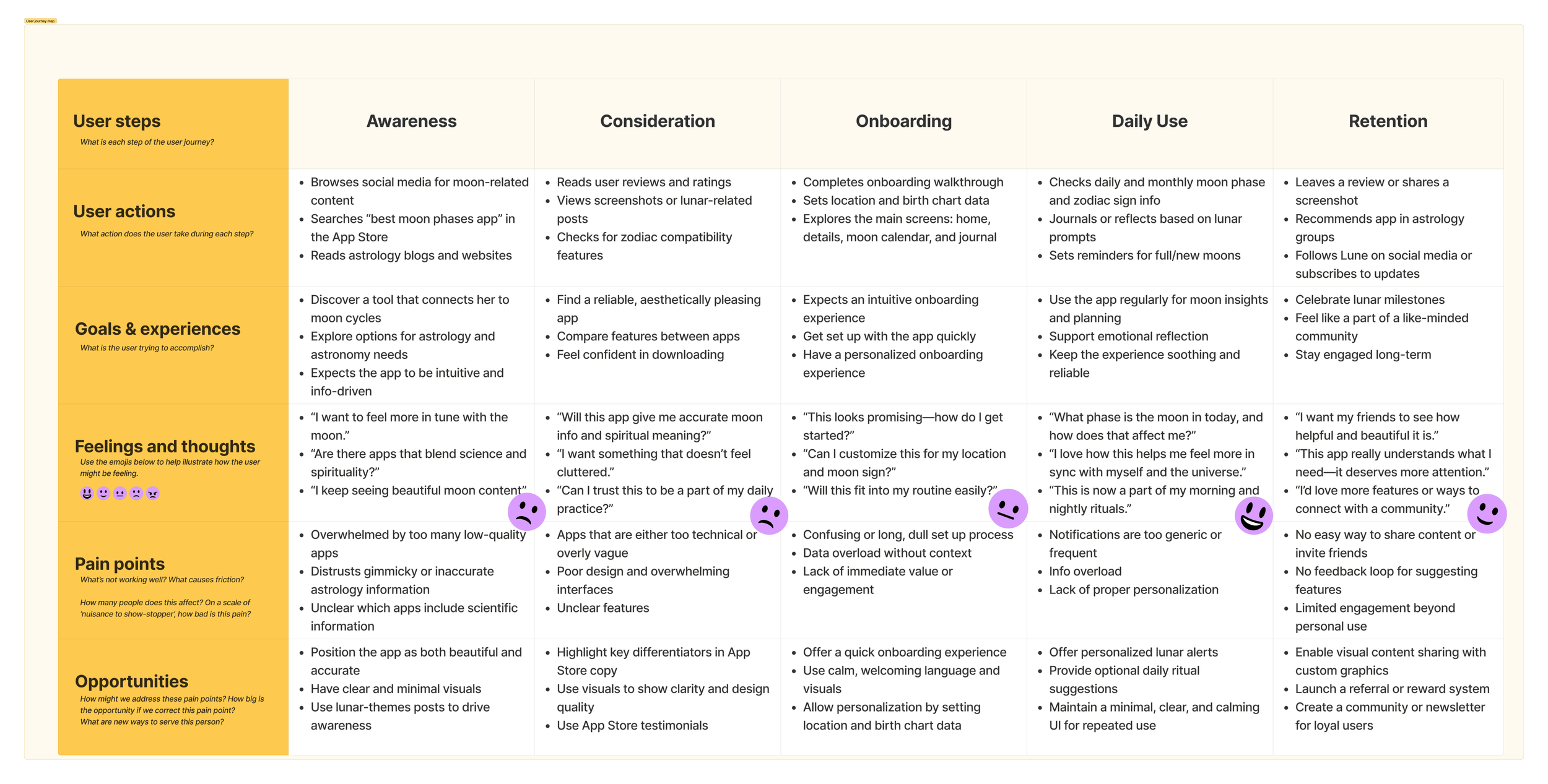
I included info about a clear design, the moon calendar, and moon details in the following locations.
Awareness Goals: Expects the app to be intuitive.
Awareness Opportunities: Have clear and minimal visuals.
Consideration Opportunities: Use visuals to show clarity.
Onboarding Actions: Explores details and moon calendar.
Daily Use Goals: Use the app regularly for moon insights.
Daily Use Actions: Checks daily and monthly moon phase information.
Daily Use Opportunities: Maintain a minimal, clear, and calming user interface for repeated use.
Retention Thoughts: "I want my friends to see how helpful and beautiful it is."
After creating an application flow and user flows, I worked on low-fidelity wireframes, displaying the moon calendar and details.
Low-fidelity Wireframes

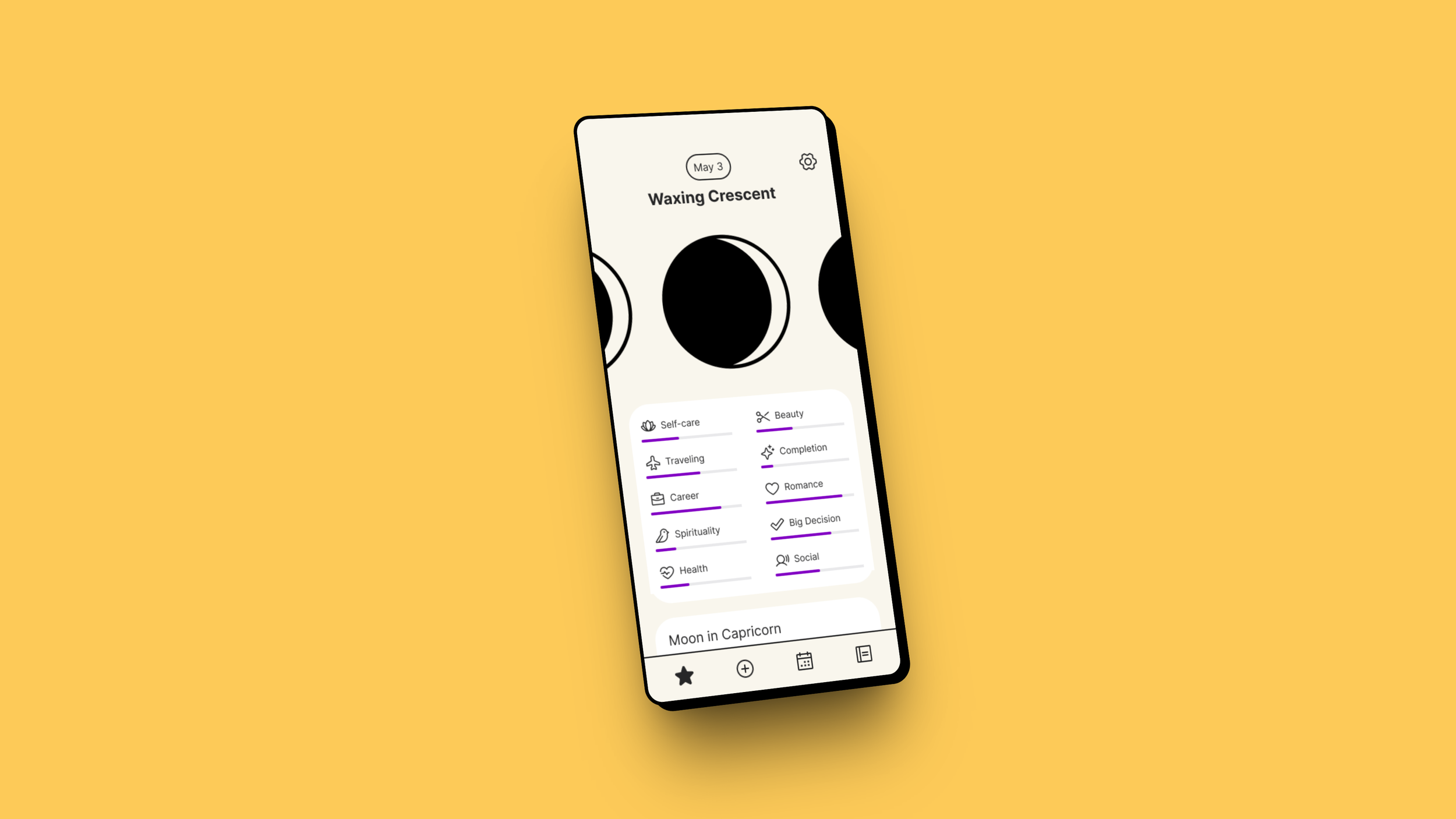
I placed the astrology information on the home screen. This was our main demographic. Astrology users who are into astronomy. Please note that I didn't make the date label a button. This is what leads us to one of our user errors.
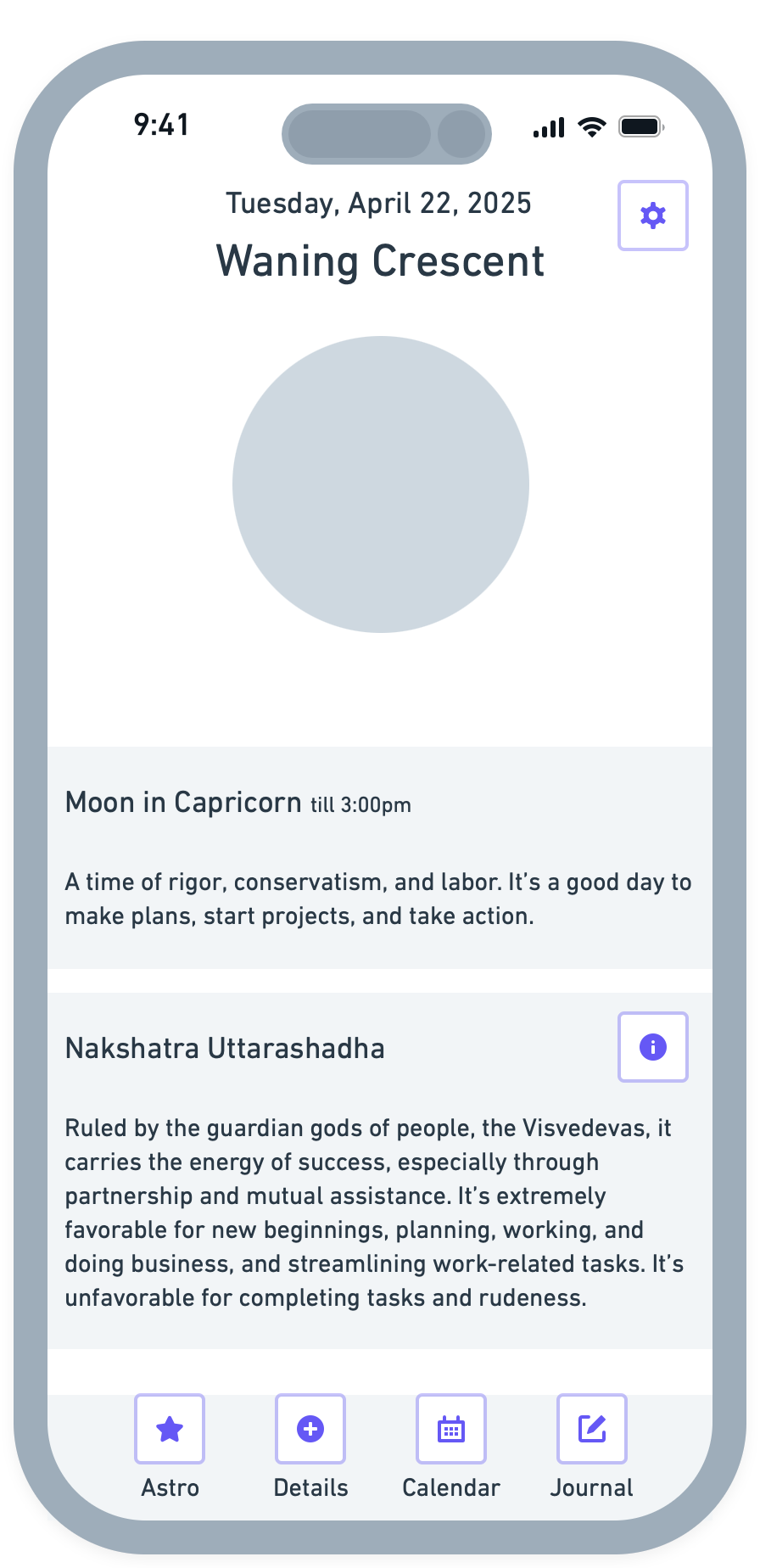
The details screen includes all of the scientific astronomy information including a moonset time and illumination.
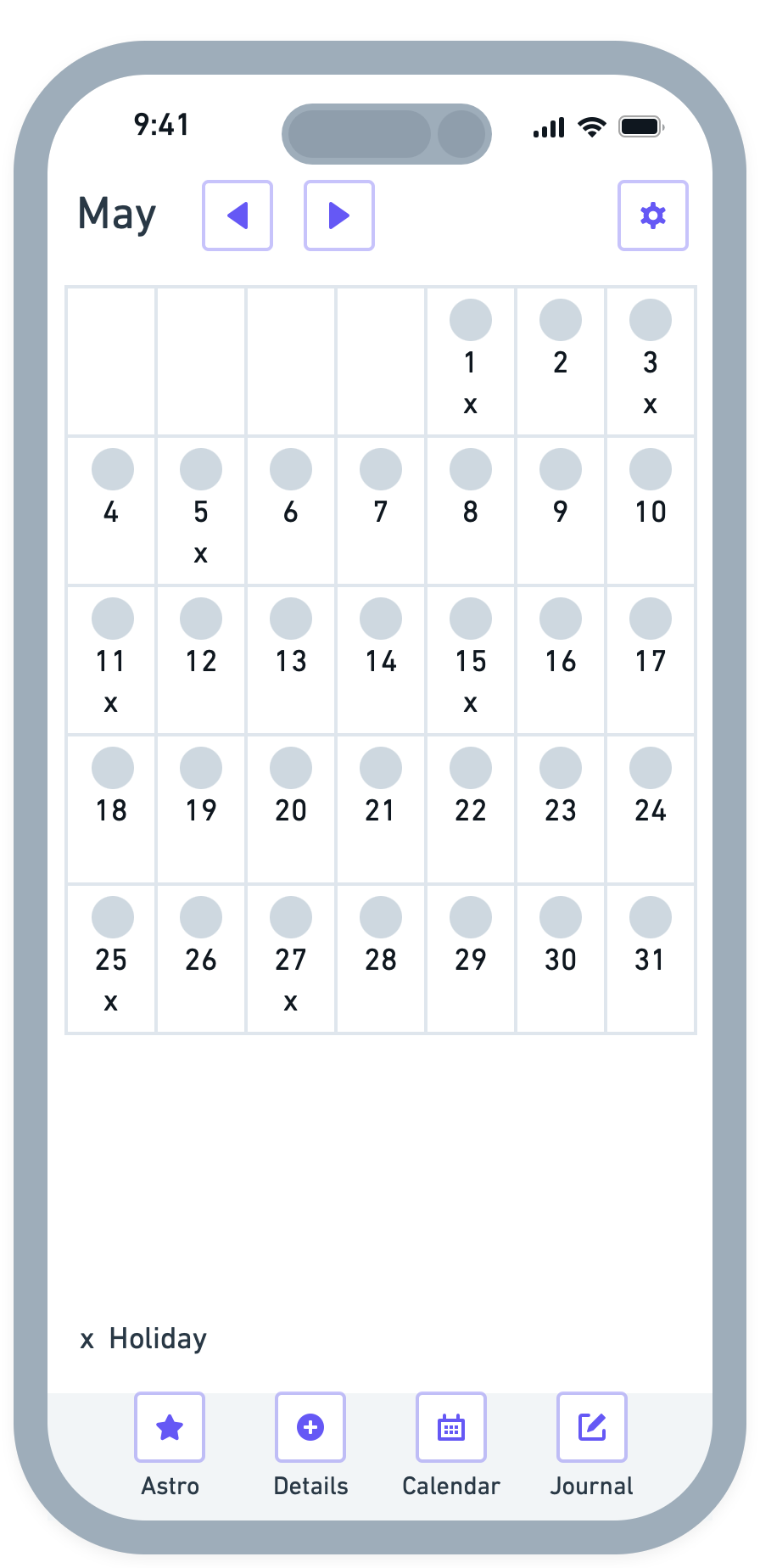
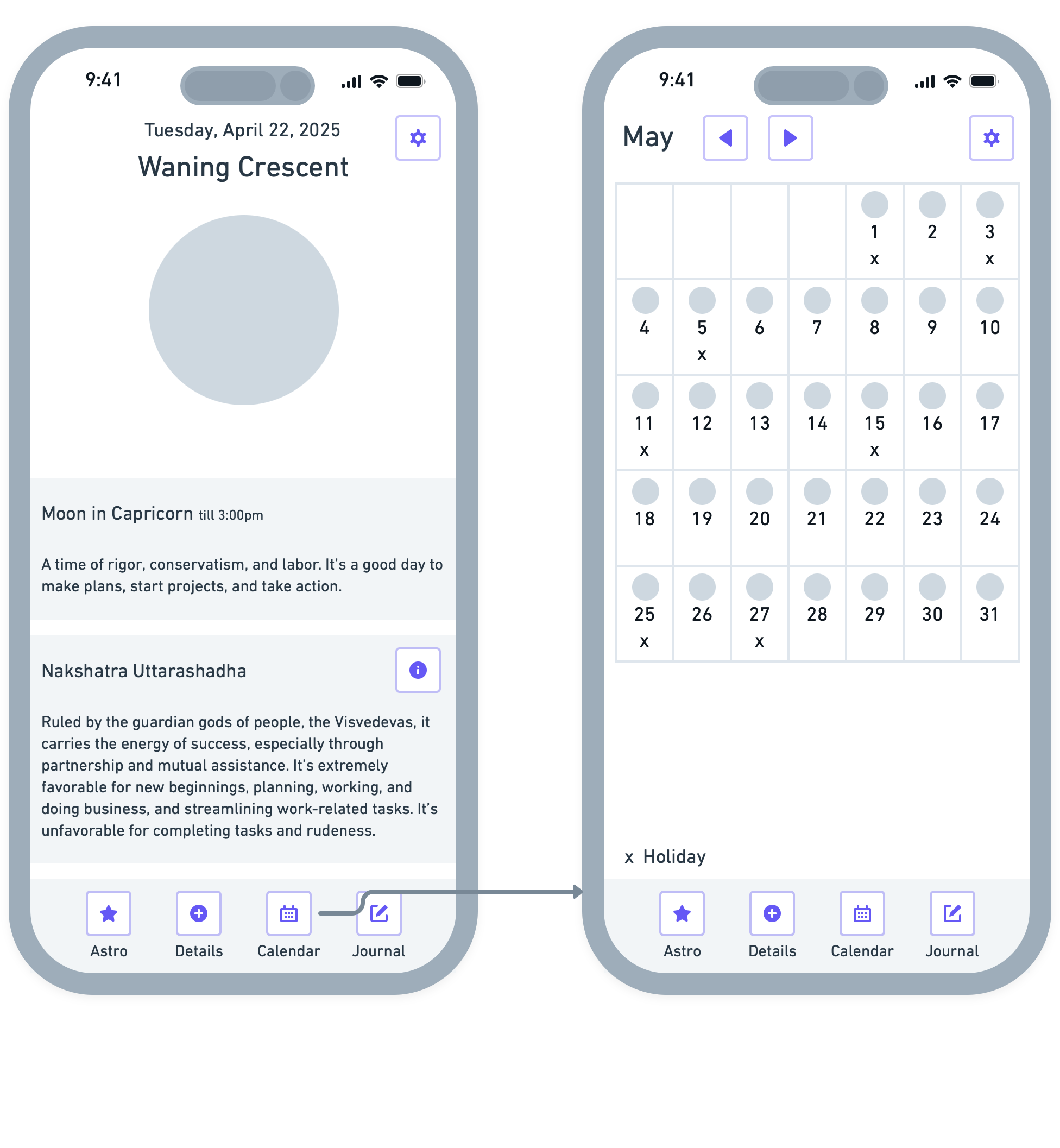
The calendar features a monthly toggle. Moon phases are shown along with a holiday label. Users can select the moon they want to view and it will load onto the home, details, and journal screens.
Next, I created wire flows.
Wire Flows
Here the wire flows show where the user errors came from.
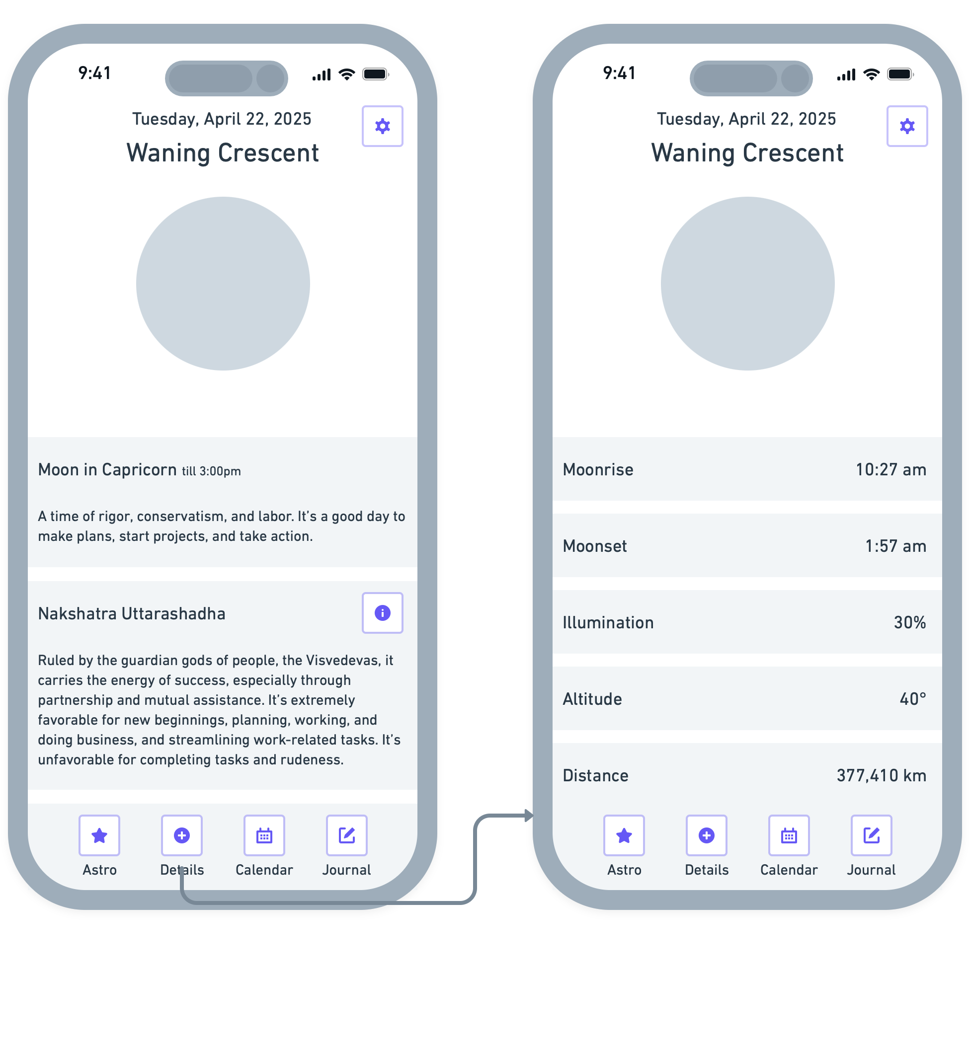
You can only go to moon details by tapping the bottom navigation button. I would later hook up the moon icon to take you to details as well. This is where the error occurred.
Same with the moon calendar. You can only go to it by tapping the icon on the bottom navigation. I would later hook up the date label to take you to the calendar. This is where the other error occurred.
Prototype
The wireframe user interface is created in high fidelity and transferred to a first-iteration prototype.
Testing the Prototype
Then, I conducted a usability test and a 5-second test. In the usability test, I tasked users to:
Find out more about today's moon
Go to next month's full moon
Journal about today's moon
I received errors on the first two tasks.
When one user wanted to go to moon details, they tapped on the moon icon first then the bottom navigation second when they realized they couldn't get there. This was our first user error.
The second came from trying to view the calendar. One user tapped on the date label first. The date label wasn't stylized as a button and therefore wasn't an avenue to get to the calendar.
This gave us a total user error rate of 40%.
Testing (Again)
After making changes, I conducted my second round of usability tests with the same users. I gave them the same tasks again. One user chose the date button and the moon icon as a way to get to the other screens.
The new user error rate was 0%. A 100% reduction.
40%
Error Rate
Iterating on Feedback
From the feedback received after the tests, I ended up hooking up the current moon's icon to the details screen. I also made the date label a button taking users to the calendar. This way users would have multiple ways to get to where they want to go.
100%
Reduction
Solution


Impact
Users expect to not think. By making an icon to show the moon details and a label for the calendar, users are now rewarded with multiple ways to access information. Tapping on the current moon takes you to its details while tapping the date takes you to the calendar. Both bottom navigation icons are included as another option to see that information.
This resulted in a 100% reduction in the user error rate.
Learnings
This project taught me that information architecture needs to be intuitive. Users may take multiple routes to get to where they want to go. Not everyone is defined by the same user interaction. One may go this way and another one that way. Having multiple options to go to the same place can account for all testing cases.
I also was taught the power of collaboration. If I was working with a team to design the app, my design oversight may not have been missed. Someone would most likely would have caught it. Thus making the error rate null from the beginning.